

But none of that matters. We need to talk about the important stuff here. The things that make football fans be fans. The things that light up the hearts of those of us that follow the game, as well as those retailers that desperately need our 2020 Depression dollars.
Yep, that's right. I think this offseason marks an all time high (seven!) for uniform and logo changes for the normally staid NFL. And, if you know that I'm a card-carrying member of Uni-Watch, you know I have some opinions on these things. Let's get it started.
The Good
Los Angeles Chargers
Ok, I'm going to put this out right now: the Chargers may have lost their All-Pro QB to the Indianapolis Colts this offseason, but they outright won the uniform contest.
Oh, myyyyyy, as George Takei would say. Check out those colors...those bolts on the pants and shoulders. And the numbers are back on the helmets, always the most Chargers thing ever. These uniforms scream "southern California," and do it with style. I even like the Color Rash (sp. intentional) version, hearkening back to earlier iterations with that rich blue hue. The alternate navy version is not so much to my liking, but can't deny it looks a little XFL-ish, but hey, it's an alternate! The yellow masks with those yellow pants....wow. Nailed it. Grade: A+
Los Angeles Rams
I started like everyone else: what a crapfest. Look at how they try to jam that circle unnaturally into the "A". What's with the multiple shades of yellow? Hey, wait a minute: this year, they will share a stadium with the aforementioned Chargers, and yet they are trying to look like them? But something changed my mind; it was seeing the logo in motion:

That changed everything I thought about this logo. It's the first time I have seen a logo designed for digital first. No longer having to be restricted to the static page, it's still state should evoke that motion in the mind's eye (and, perhaps, augmented reality? You hearing me, Rams folks?). That made the logo come to life, evoking Pacific sunsets, the perfect SoCal wave to surf, and more. Add in an actual attempt to design this to the Fibonacci Sequence...are you kidding me? Combined with the royal blue and yellow that are iconic to Los Angeles, and I was sold.
Does it look good on hats and shirts? No, not really. The Ram's head does, though, and reminds me of when the New England Patriots moved from Pat The Patriot to Flying Elvis: it streamlines and makes it much easier to reproduce for merchandise sales. Honestly, I think the Rams may end up like the Bucs did (more on that later) and try to get people to see where they were going, but they may be a bit ahead of their time. Grade: B+
Oh, one more thing...the uniforms have yet to be revealed, so we may be in for a whole new evaluation.
Tampa Bay Buccaneers
There was, quite literally, no where to go but up. This is the abomination they graced the field with for the last 5 years:
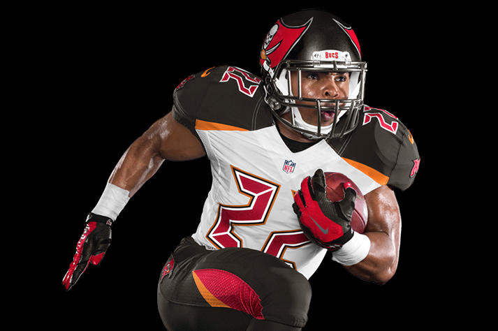
So many things to say about this awful costume. The "alarm clock" numbers "they were supposed to be "slashed with a pirate sword"), the cartoonishly large logo on the helmet....it cannot be stated how awful these were. Conveniently, the team performed just as horribly in them, and just as conveniently, they enter the offseason by jettisoning the quarterback they had who set a record for 30 interceptions thrown last season for Tom Brady, coming down from the land of championships and agelessness. And how will they welcome this new era of Tampa Bay Football?
If those uniforms look a little familiar, yep, they pretty much went back to the ones they wore prior to the change. You know, the ones they won a Super Bowl with? I debated what category to put this in, as these are not so much "good" uniforms, but the stain of those debacles they wore for the last 5 years makes this such a good correction, it merits to be here. I do wish they had not retreated, but instead learned and evolved, but the fans were not going to take another 5 year misstep. Grade: B
The Bad
Cleveland Browns
Ok, it's another case of "addition by subtraction." The Browns, like the Bucs, admitted defeat in their current 5 year getup and went back to that classic Browns look. Yay, let's give the win to the purists!
Except the old uniforms sucked, too.
So now, we've traded what at least was an attempt to bring some personality and recognition to a team that has perpetually struggled with a relatable identity for the generic (or, I suppose, "iconic") look of the team that won championships back in the pre-NFL/AFL merger days...and hasn't sniffed a Super Bowl since.
Did you know the team actually isn't named after some beloved pet, colorful local legend, or the like? Nope, they were actually named after the team's original coach and GM, Paul Brown. Now, to be fair, in 1945, Paul Brown was a popular Ohio sporting figure, but he got into a pissing match with the team's owners, and defected to the AFL to found the Cincinnati Bengals...a team with the same colors, but the intelligence to recognize you'd have better luck making your team more marketable by naming it after an animal (any other pro sports team try that? Oh, yeah, I think a few).
It's time to bring out the revolution: re-name your football team, Cleveland. Yes, you accomplished the rarest of the rare feats: you were able to keep your team's identity and name after the actual team defected to another city (and won a Super Bowl after doing so). It will be in the history books, and, in some ways, magnified the importance of a team's brand from that day forward. But your team's uniform and colors are in desperate need of a restart. Imagine the excitement as the country tries to help you rebrand, the way you will dominate the news cycle with every little cryptic hint, the multiple ways your quarterback can pretend to live in your stadium.
It's time, Cleveland. You cleaned up the river. You made the Rock N' Roll Hall Of Fame a Thing. Let's redo the Browns. Grade: C
Atlanta Falcons
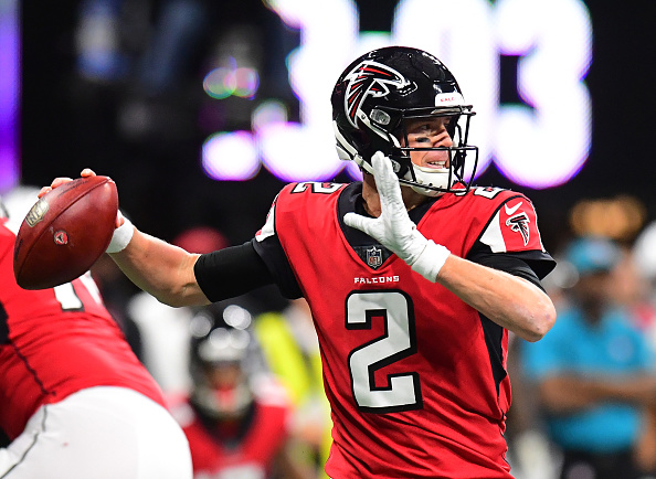
The Falcons unveiled an amazing new stadium last year (hello, Oculus!), but their Nike redesigned uniforms tended to make them look...well, clownish. They've always struggled with the balance of red, white, and black in a way that few teams have (Chicago Bulls, anyone?) The reality is that their most iconic look is and has been their "throwback" look to the days of Neon Deion and Mike Vick: that dominant black jersey, with white pants and white numbers, all accented with red. So the look they've been sporting a while, while not as horrific as the Bucs, nor as polarizing as the Browns, hasn't lit up the imagination.
Enter 2020.
You want your throwback? Got it. How about a Color Rush outfit that goes all black? Well, yes, even if it has a damned red side panel. Like that leotard effect for the away togs? Yep, hello all white. Some more "falcon-esque" fonts for the numbers? Point your beaks this-a-way.
But...we have to talk about the two elephants in the nest. The first: the gradient home uniform, starting red, then generally fading to black as you go down the body. Um, have we not learned from the Jacksonville Jaguars' 5 year experiment with gradient helmets? This effect simply does not work. I'd be interested in seeing if, unlike the Jags' domes, this gradient grows on me. Right now? Nope, but I'm open to it changing.
Not so much with the "ATL" on the front of all but the throwbacks. Yes, the intertubies have lit up with the "congratulations, you're the first team to have an airport code on your shirts," but it's definitely a polarizing element. Personally, I think it evokes more of what the Browns did with the big honking "CLEVELAND" in the same placement for the last 5 years, but makes it even "edgier" with the not-so-cool abbreviation. Look, ATL is no NOLA, folks, and the Saints keep it so classy, they don't even need their city's cool abbreviation on them...unlike their basketball team.
Overall, I'd say this much-needed revamp takes a few too many cues from the Jaguars' worst elements, but combines them with the very cool and sometimes innovative designs the NBA has been using (see the City editions they released). However, while an upgrade from what they had, it's a little too muddled to make an iconic look, and kind of feels little like MLB's "Turn Ahead The Clock" attempts: you reached, but fell short. Grade: C+
Los Angeles Chargers
The Chargers also released a new logo in advance of the new uniforms (hey, why not get two news cycle bumps instead of one?):

This one...mmm..not so much, compared to those stunning uniforms. It's fine, a little flat, but feels remarkably generic. Grade: C-
The Ugly
Indianapolis Colts
Remember when the old Cleveland Browns packed up and headed to Baltimore? You know, the city that lost a team called the Colts to Indianapolis a while back? Well, turns out when the newly rechristened Baltimore Ravens took the field, they shed their old Browns identity and chose a new logo:

That logo, it turns out, was stolen from a security guard who had submitted the logo when he heard the newly renamed Ravens were headed to Baltimore. A few years later, the team was forced to stop using it and they have never spoke of it since.

Why do I bring this up? Because, in an odd twist of the "Baltimore Curse," it seems that the Colts have done the same. The Colts only made slight tweaks to their uniforms (they rounded the horseshoe on the helmet a bit), but they did unveil a new secondary logo, as you can see here, with the negative space of the "C" being manipulated to show the state of Indiana. Secondary logos are used for on-field accents (like end zones), caps, and occasional other things. No big deal, right? Well, no...unless your name is Jere Kubuske. And you coach football. And you coached for a high school in Indiana. And you created a logo for that Indiana high school. And you used it in various places for about half a year. And it looked like this (Jere's on the left, Colts on the right):

Oh, did I mention that there are some personnel on the Colts who played on Jere's team when he coached in Indiana (he since has moved on to coaching high school football in Green Bay, WI; let's hope the Packers don't get a hold of his sketchbook!)?
Yeah, this is thievery, plain and simple. Like the Ravens, there may be a multitude of factors at play that make it less evil and more unintentional, but it deserves to be called out as the ignominious act it is. Indy, make it right: either credit Jere, pay the man, or drop the new logo. Oh, and since when do horseshoes have "grommets?" Grade: D, but only because of the sleaze factor...and the grommets.
The New England Patriots
How can a team and organization, who suffered every bumbling embarrassment for most of their existence, followed by 20 years of success, six Super Bowl Championships, and the greatest coach and quarterback of all time have done so in some of the most generic uniforms ever made? The one thing those Pat Patriot duds had was an iconic look; the ones they have worn for the last 20 years reflect the sense of personal style of their coach: whatever.
So now, you can finally right the wrongs, make the moves, give the team a much needed uniform improvement. You have a rich history to draw from, both in the Revolutionary War team name, as well as the unmatched 2 decades of success. You can boast a little swagger, put on some class, not have to shop at Kmart. Let's see what you came up with!
Are you kidding me? Back when I lived in New England and was growing up, we had our own versions of Kmart and Walmart: they were called Bradlees and Ames. You know, the department stores that couldn't afford to pay licensing fees to popular sports leagues, so they offered merchandise that was in the team colors, but a very basic look? One that screamed out "I don't have enough money to even buy the right knockoffs and I'm too young to know how embarrassing it is"?
Ladies and gentlemen, I give you the 2020 New England Patriots. Outfitted by Bradlees. Yep, they took bland and generic and said "we can make it even less interesting." Grade: F. No, F-. No, not bad enough: X.
Oh well, at least the fans will have their favorite player and world class TE looking better this year. Pity it will be in Tampa, though.
Comments